Future Improvements
1
1
Create more user flows ie. My Profile, Settings, Help
2
2
Carry out more usability testing
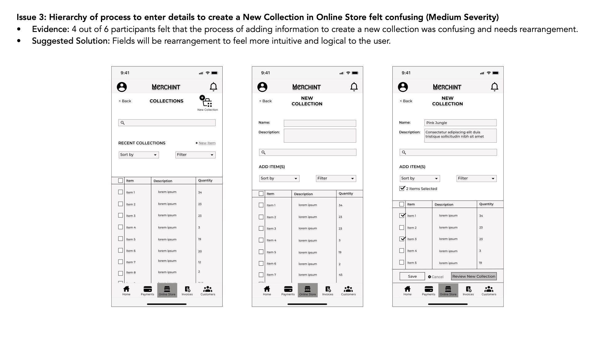
3
3
Add more necessary features ie. Share to social media button
4
4
Refine UI of the app more
Considering that this was my first end-to-end UX Design project with Career Foundry, I am proud of what I have done so far. I learned that interviewing potential users/customers, getting their feedback and usability testing is one of the most important aspects of validating the existence of an app and its functionality.
I have yet to learn so much and still have many improvements to make on the Merchint app.
Retrospective
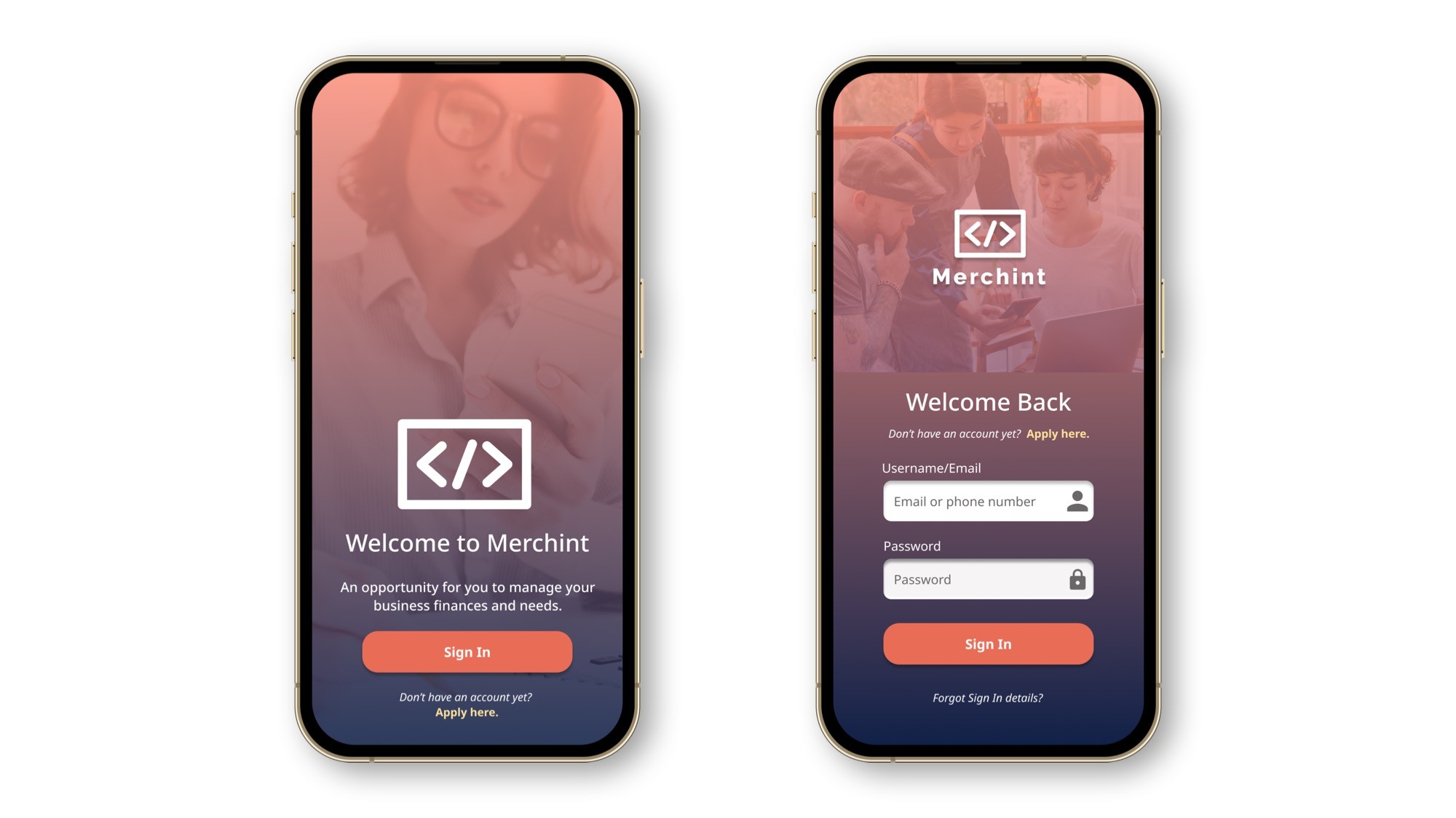
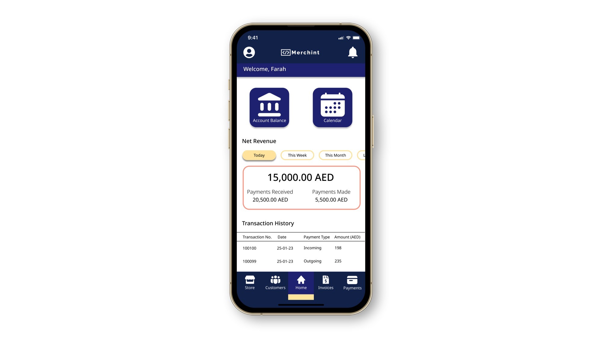
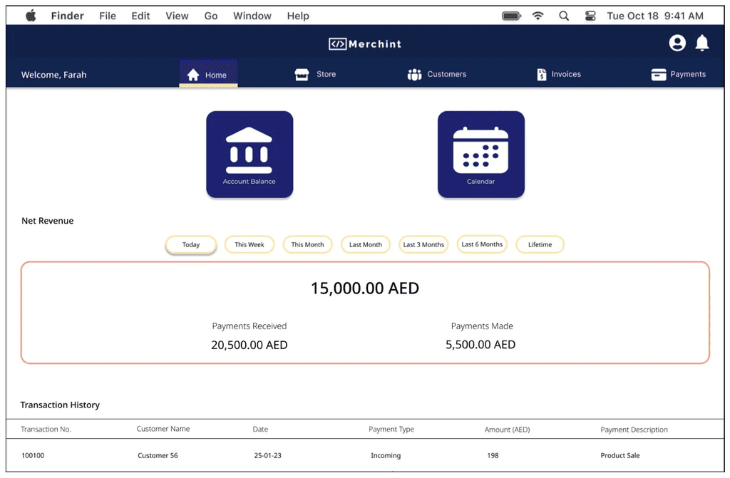
High-Fidelity Prototype
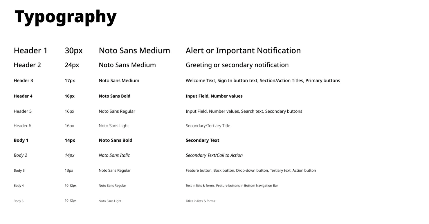
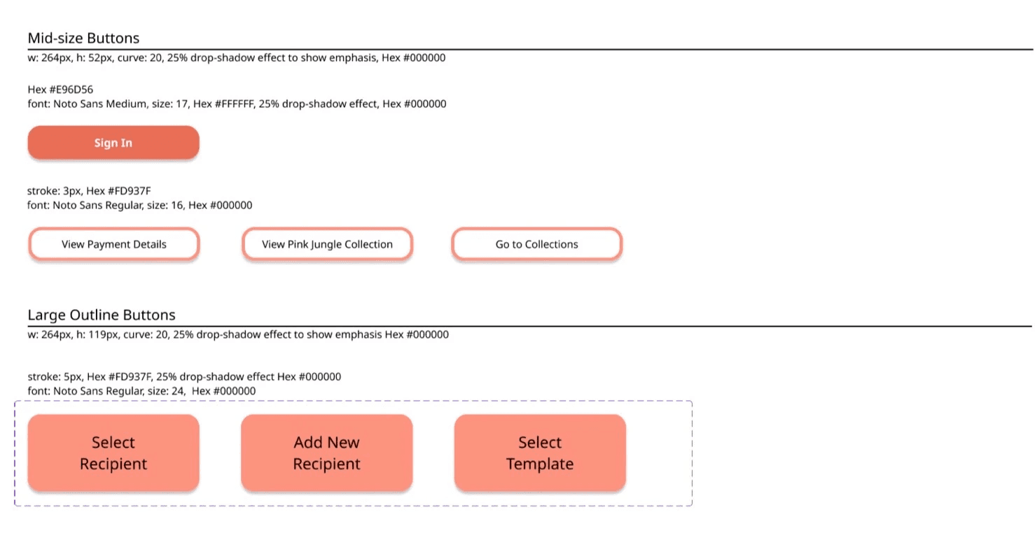
Design Language System
Updated Wireframes
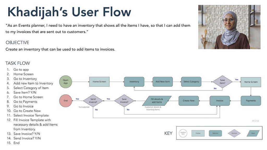
Mapping was created for three flows that our user personas would go through to show their progress in the action they take, while keeping my business objectives in mind. Here, Khadijah's user flow is shown.
User Flows
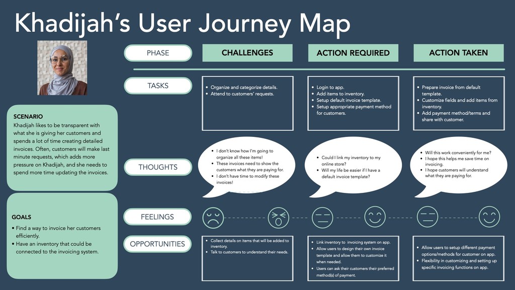
A user journey map was created for all three personas. Here, Khadijah's journey to complete a process is shown.
User Journey Maps
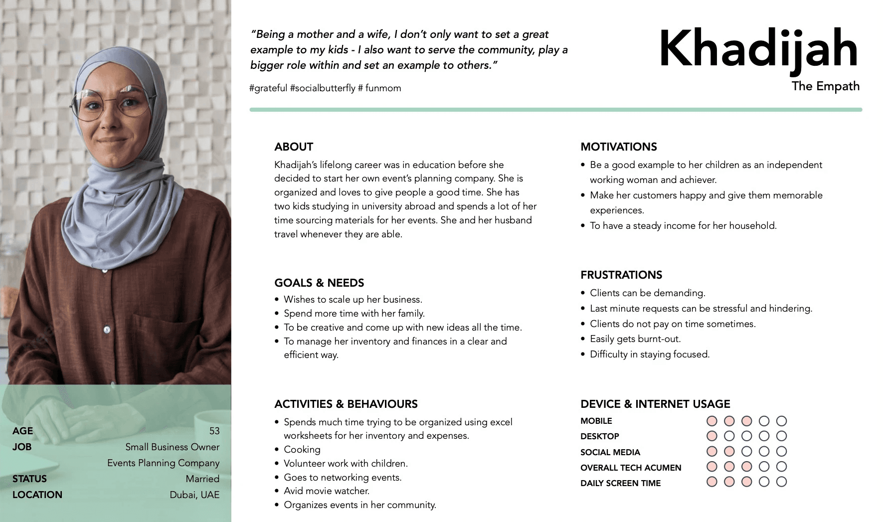
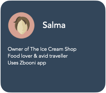
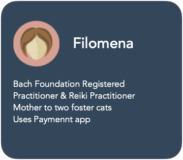
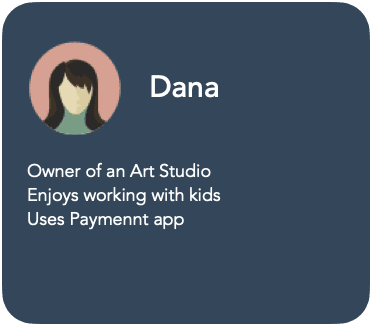
By combining the information from the above, I set out to create personas that represent my target audience through their behavioral patterns, goals, challenges and other factors.
Below is an example of one out of three personas that I created.
User Persona
Considering that this was my first end-to-end UX Design project with Career Foundry, I am proud of what I have done so far. I learned that interviewing potential users/customers, getting their feedback and usability testing is one of the most important aspects of validating the existence of an app and its functionality.
I have yet to learn so much and still have many improvements to make on the Merchint app.
Retrospective
The design was refined, menu features were moved to the top bar with a grid system that was used for reference.
UI was also added with similar visual references as the mobile app.
To ensure that the web app can adapt to different screen sizes and to create fluidity when users browse through it, the designs were applied to a MacBook Pro 14” screen size.
Responsive Framework
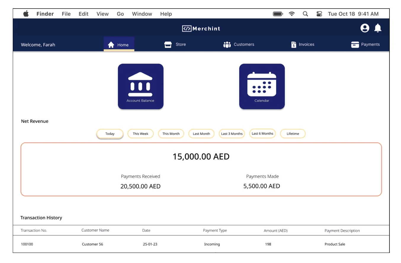
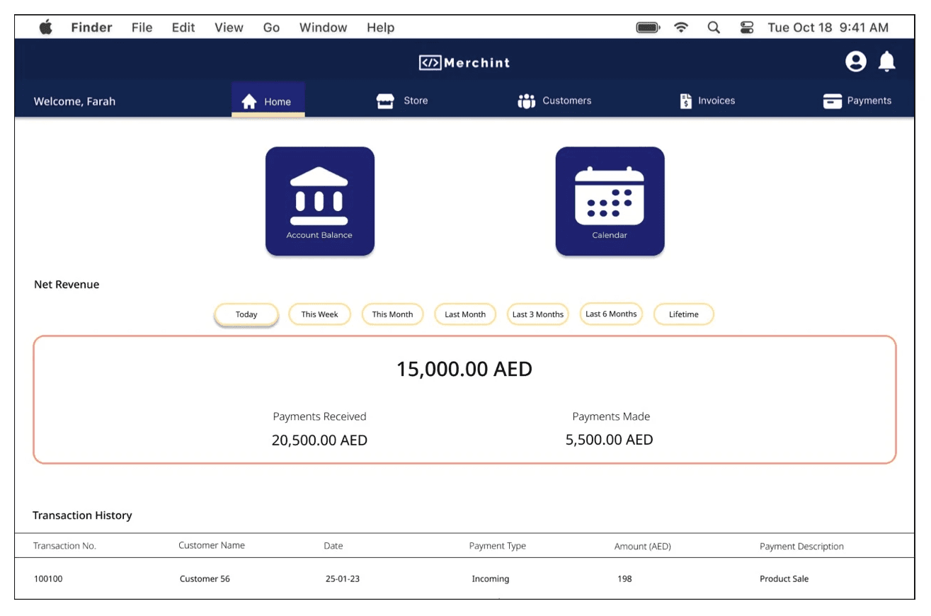
Desktop High-Fidelity Wireframe:
The design was refined, menu features were moved to the top bar with a grid system that was used for reference.
UI was also added with similar visual references as the mobile app.
To ensure that the web app can adapt to different screen sizes and to create fluidity when users browse through it, the designs were applied to a MacBook Pro 14” screen size.
Responsive Framework
Desktop High-Fidelity Wireframe:
Future Improvements
Future Improvements
1
1
Create more user flows ie. My Profile, Settings, Help
Create more user flows ie. My Profile, Settings, Help
2
2
Carry out more usability testing
Carry out more usability testing
3
3
Add more necessary features ie. Share to social media button
Add more necessary features ie. Share to social media button
4
4
Refine UI of the app more
Refine UI of the app more
Design Language Systems
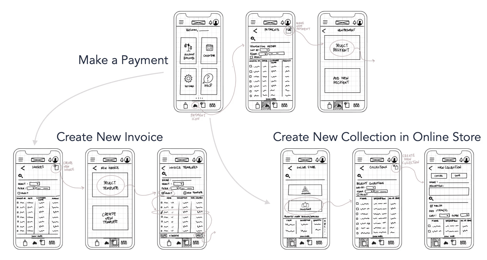
Hand-sketches were made on Procreate to highlight the high-level functionality of the design and show navigation for the three user flows.
Low-Fidelity Wireframes
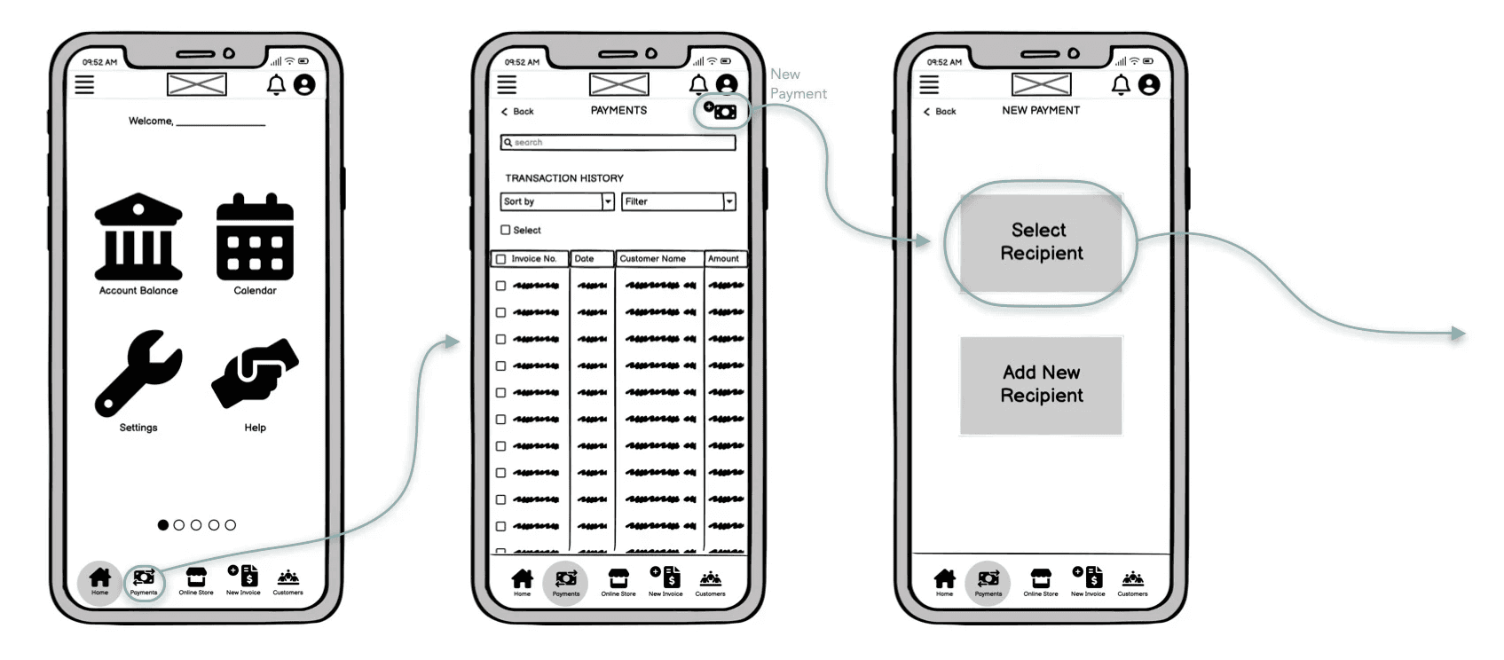
Here, basic functionality is shown to convey form, function and specifics of the UI.
Mid-Fidelity Wireframes
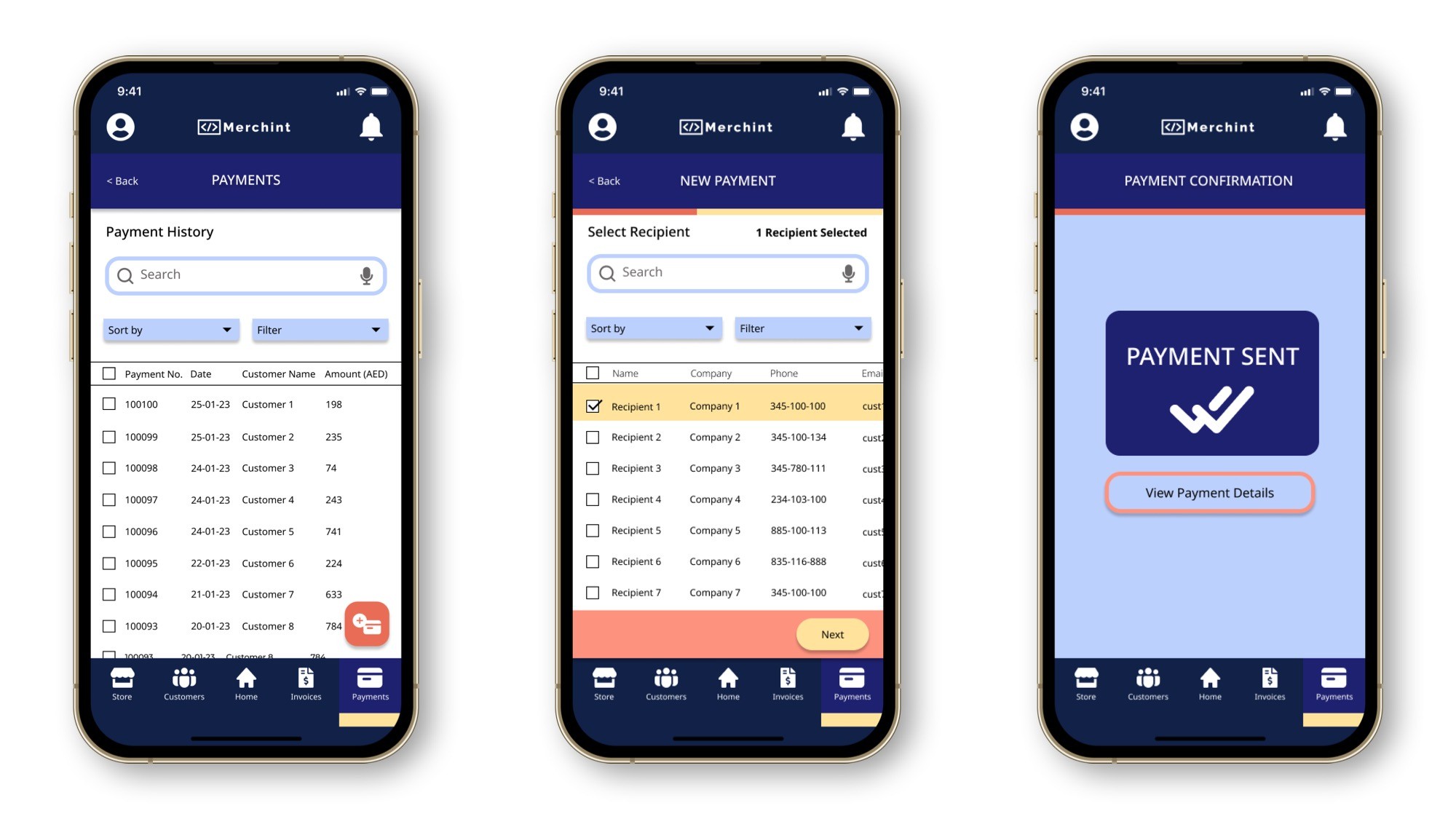
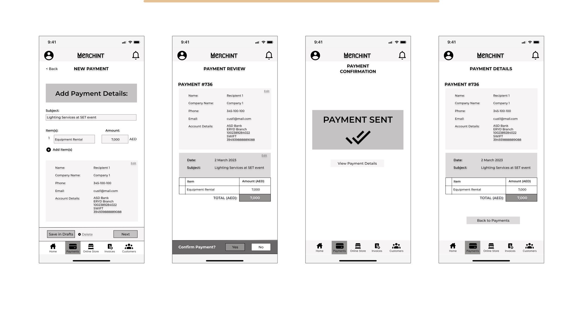
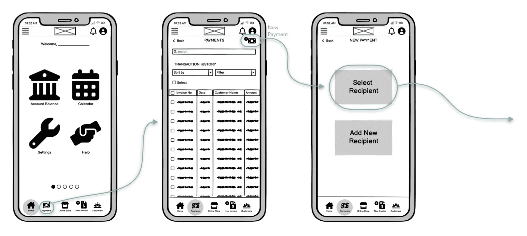
Make a Payment
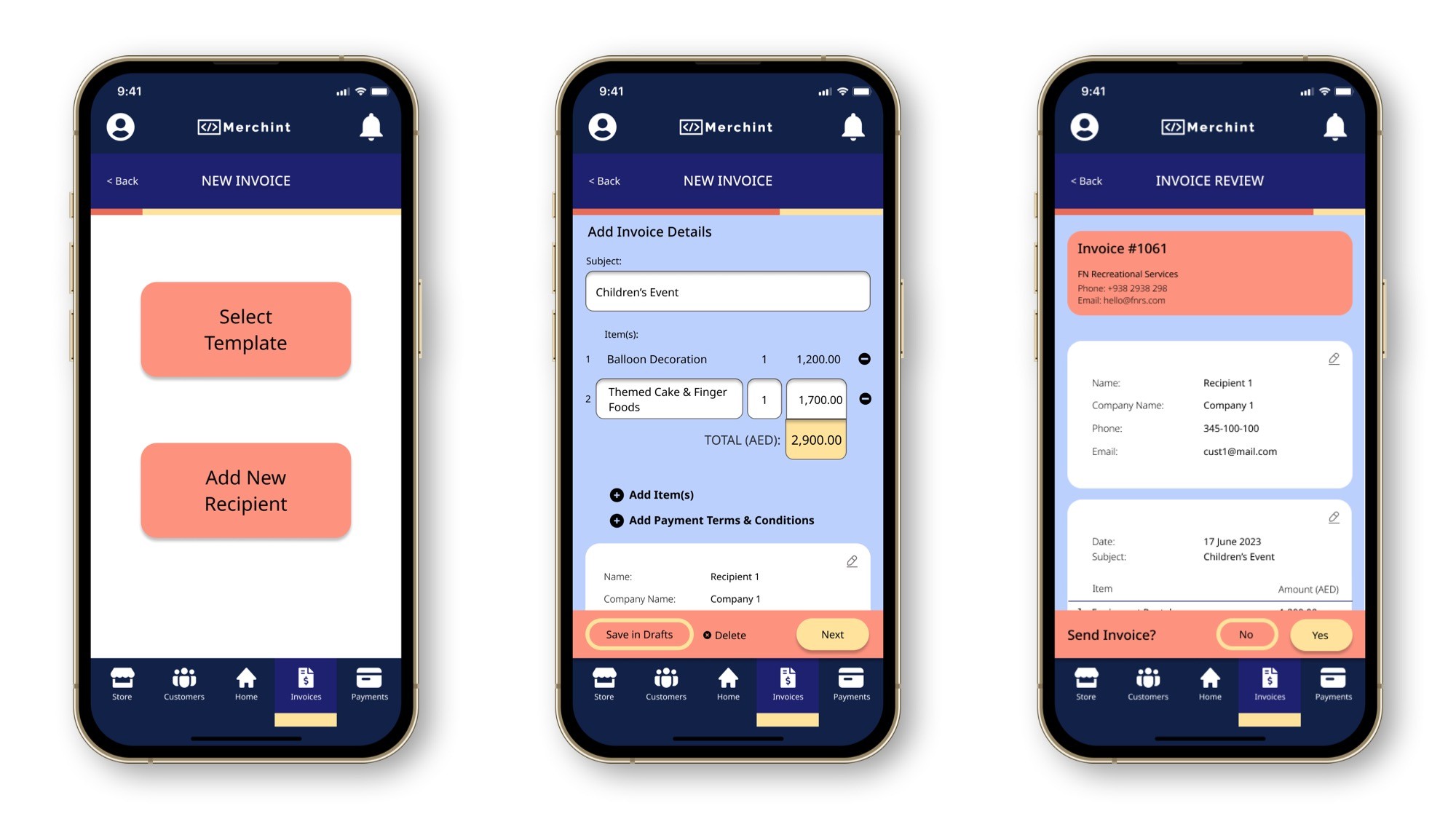
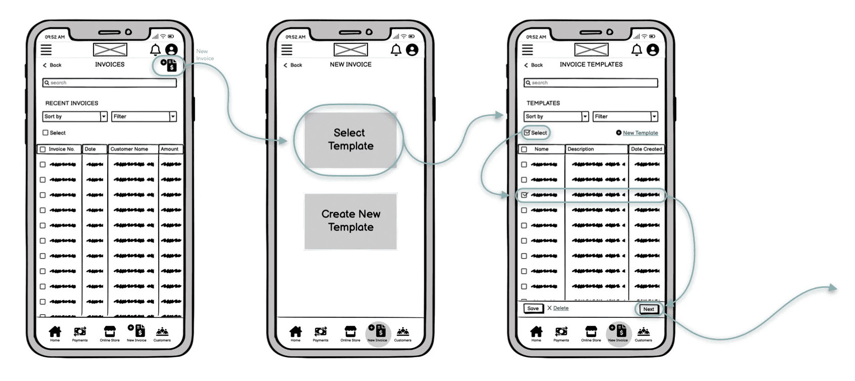
Create New Invoice
Make a Payment
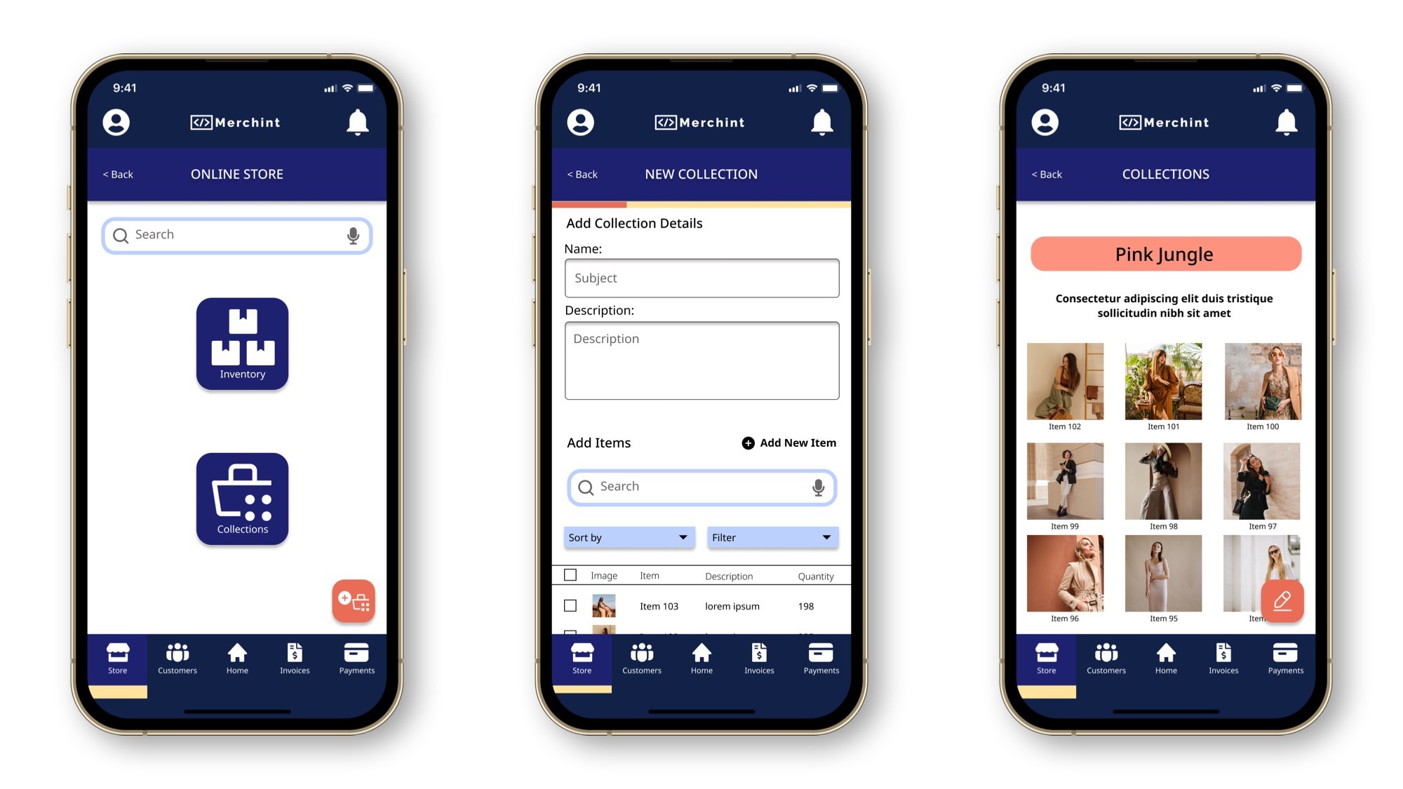
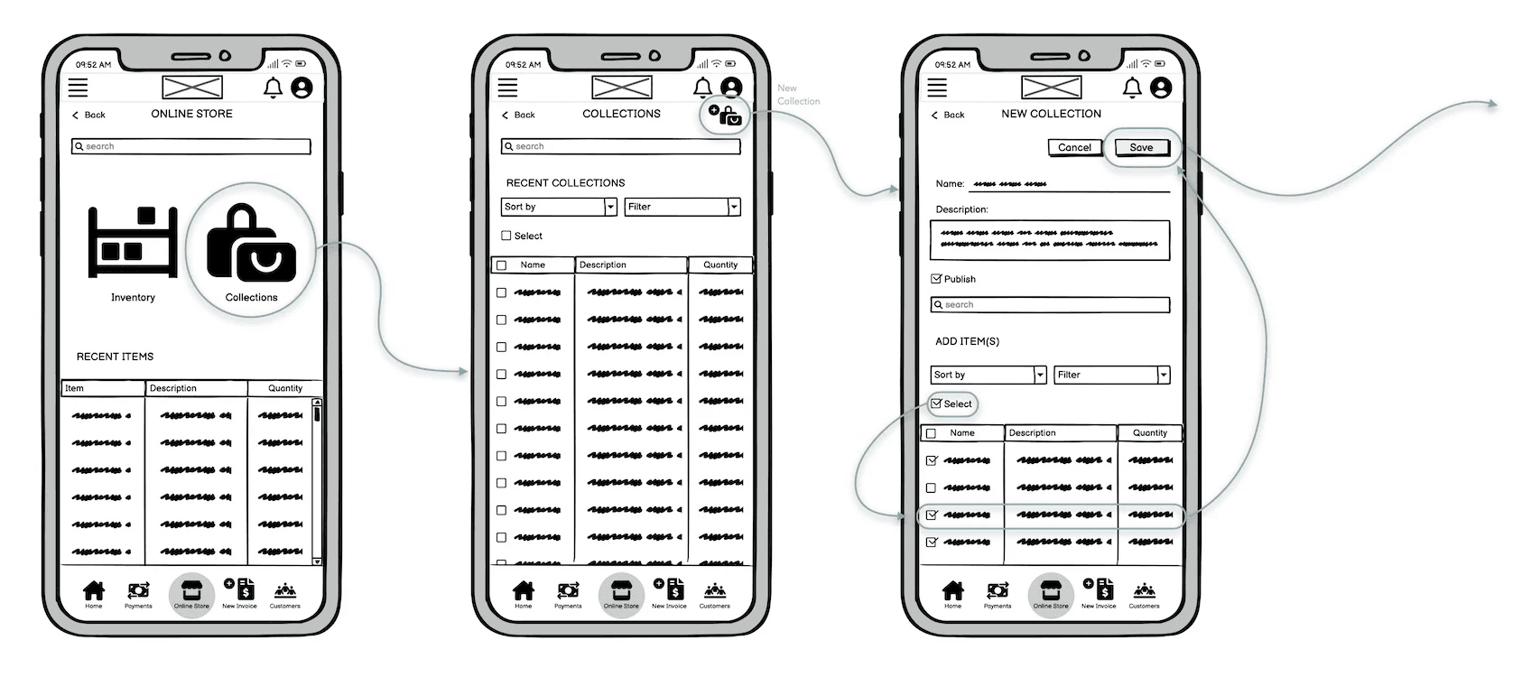
Create New Collection in Online Store
Updated Wireframes
High-Fidelity Prototype
By combining the information from the above, I set out to create personas that represent my target audience through their behavioral patterns, goals, challenges and other factors.
Below is an example of one out of three personas that I created.
User Persona
A user journey map was created for all three personas. Here, Khadijah's journey to complete a process is shown.
User Journey Maps
Mapping was created for three flows that our user personas would go through to show their progress in the action they take, while keeping my business objectives in mind. Here, Khadijah's user flow is shown.
User Flows
The design was refined, menu features were moved to the top bar with a grid system that was used for reference.
UI was also added with similar visual references as the mobile app.
To ensure that the web app can adapt to different screen sizes and to create fluidity when users browse through it, the designs were applied to a MacBook Pro 14” screen size.
Responsive Framework
Desktop High-Fidelity Wireframe:
Test participants were recruited, test objectives and methods were determined, a test plan was developed and a test script was written.
Test participants were recruited, test objectives and methods were determined,
a test plan was developed and a test script was written.
Usability Testing
6 Participants
6 Participants
30 mins
30 mins
The following was the outcome:
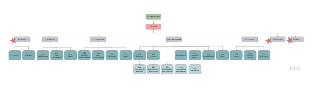
The Sitemap was revisited after carrying out the card sorting exercise with the participants and changes were applied.
Sitemap
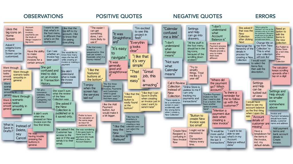
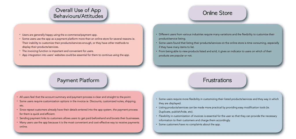
I used the Card Sorting method via Optimal Workshop. It is an interesting way that shows how users think and feel. Often as designers, we assume that users would want the flow to be in certain way, but testing it could prove otherwise. Our findings are as follows:
IA & Sorting
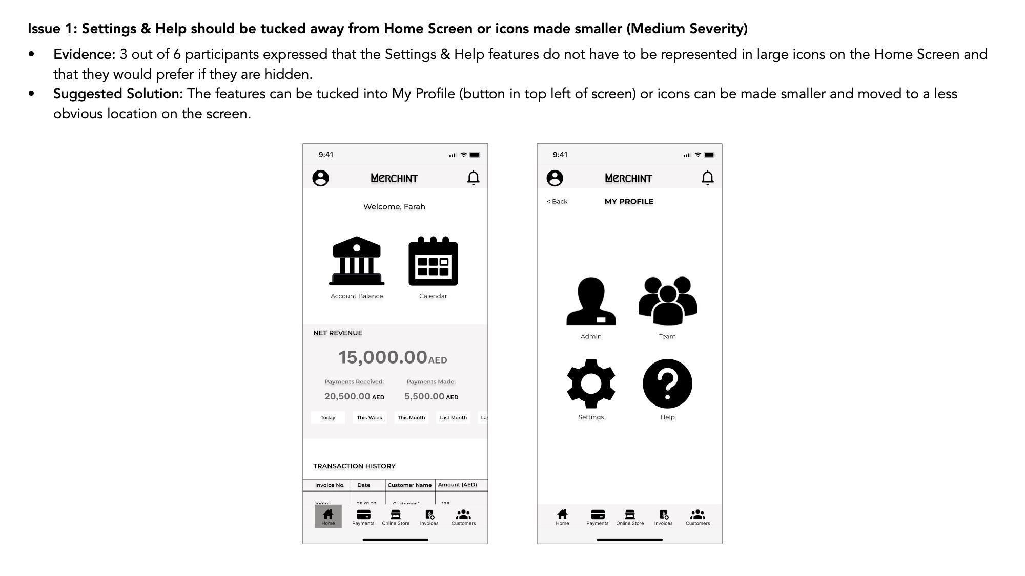
Users wanted My Profile and Help as main categories under Home, instead of under Settings.
Most categories/sub-categories were aligned as I had initially placed them on the sitemap, as was reflected in the Standardization grid and similarity matrix.
Category names should be precise and deciding what cards to present to participants should be very well thought of to avoid confusion on their behalf.
Would be interesting to re-visit the individual categories with their respective sub-categories in more card sorting exercises.
Affinity Mapping
Affinity Mapping
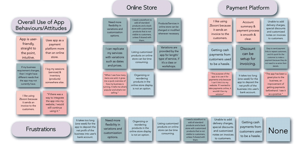
Affinity Map Insights
Research Goals :
Research Goals :
Identify the background of potential users.
Understand what users use to carry out financial transactions, to stay connected to their customers and how they sell their products/services.
What features/functions the users enjoy, in addition to their pain points while using existing platforms in the market.
SURVEYS
SURVEYS
20 Questions
20 Questions
8 Participants
8 Participants
Key Findings:
Key Findings:
Most users mentioned that what they liked most about the payment app they are currently using is that it was easy to create payment links that could be sent to their customers, in addition to inventory and finances that are automatically updated in their accounts.
Features/functions that the users felt need improvement were in: providing payment reminders to customers, allowing discounts on selected invoices, adding delivery charges to invoice, 24/7 customer support, and having more comprehensive sales reports.
Users mentioned that to increase the sales of their products/services, they would need marketing and promotion, in addition to more variation when listing the products/services.
Research Goals :
Research Goals :
Understand what features users need and want on an e-commerce/payment app.
Define the flow and IA of the user’s journey through the app.
Identify positive points and pain points about the existing app(s) that they are using.
Understand what features users need and want on an e-commerce/payment app.
Define the flow and IA of the user’s journey through the app.
Identify positive points and pain points about the existing app(s) that they are using.
INTERVIEWS
13 Questions
3 Participants
Key Findings:
Key Findings:
All users use the e-commerce/payment app through their mobile phones.
All users must be licensed, or have a licensed business.
2 out of 3 users said that they only use the app as a payment platform, and not as an online store because they were not sure how to list their products appropriately.
With regards to listing their products, some users did not find the flexibility or enough features/variations to support displaying their product on the online store (ie. Product variation, type of service, length or time of service).
All users receive payments from their customers through various methods ie. Cash, bank transfers, payment links.
All users are satisfied with the way their account summaries are displayed on the e-commerce/payment app that they are using.
INTERVIEWS
13 Questions
3 Participants
User Research
I was able to determine the users’ needs and pain points by conducting a survey and user interviews.

User Stories

For this project there are two different types of roles:
User/Merchant - the freelancer or SME that is using the app to sell their products/services and manage financial transactions and inventory.
Customer - who purchases products/services from the User/Merchant on the app.
Users will make up the bulk of user stories, however it is important to consider the Customer’s point of view as well to validate the User’s needs and requirements and address their pain/friction points.
1
1
Sign up / Open account flow, verification process of user
As a User, it’s important for me to know that the app is secure, so that I do not have to worry when I submit all my personal documents to open an account.
2
2
Online store/Inventory for users to list their products/services, that include invoicing options
As a User, it’s important for me to know that the app is secure, so that I do not have to worry when I submit all my personal documents to open an account.
3
3
Payment gateway connection
As a User, I need to ensure that the payment gateway I am using is secure, so that mine and my customers’ financial details are not compromised.
4
4
Account, admin and financial management
As a User, it is important for me to be able to give my team access to the dashboard, so that we can all be aware of the what is happening with the business and stay up-to-date on orders.
As a User, I need access to my accounts summary, so that I can keep track of the financials of the business.
5
5
Payment modifications including discounts, subscriptions and refunds
As a Customer, I would like to get discounts, be refunded if necessary and/or be able to subscribe to a product/service to enjoy the shopping process and avoid inconveniences.
Paymennt is a hybrid app that claims a faster, simpler and friendlier payments experience. They emphasize on SME’s being able to create a complete online store for free where they can sell their products/services and offer cost-effective transaction fees.
SME users would be able to customize their online store with options provided and would have the ability to keep track of their online transactions and send payment links to individual products.
Being a hybrid app is an advantage and can provide flexibility to the user on where they would like to access their account. User can scan a QR code on their webpage to view their account on a desktop.
Variation and customization options provided for user when listing their products/services. However, this could be improved more.
Provides easy integration with user’s existing website.
Recurring subscription payment option is excellent for users who use subscription-based business models.
They provide many channels to contact support ie. Email, phone and chat.
They claim a quick 5 minute sign up process but it took almost 10 minutes (excluding time for user documents approval).
App management manually sends very short videos on how to use certain aspects of the app (onboarding) via Whatsapp. This could be overwhelming and tedious.
Overall UI could be improved to be more attractive. The excessively white background can be off-putting and may need the user to put in more effort to read the text.

Zbooni is a connected-commerce native app that emphasizes on personalizing business. It offers SME’s a platform for the business owners (primary users) to interact and have transactions with their customers, and to enable payments.
It also offers a Marketplace that allows users to display their products and services with personalized re-marketing tools and the ability to track everything.
They’ve adopted the c-Commerce model to address changes in purchasing behaviors and expectations.
Smooth sales process from anywhere at anytime.
Capture sales on same channels users interact with their customers ie. Social media
Requires user to sign up by submitting legal documents first without clear onboarding process.
No option to contact customer service through the app. Instead, user has to go to WhatsApp to find the contact.
No product/services review by customers.
Limited variation and customization options that could be problematic for user when listing products/services.
UI could be improved.
Competitive Analysis
By completing a SWOT Analysis of my competitors, I was able to incorporate their strengths into my design, and turn their weaknesses into opportunities.
Below is a summary of the most prominent points:
Table of Contents
Table of Contents
My Role
My Role
UX Research, IA, UX/UI Designer
Project Duration: 7 Months
UI Designer (85%)
UX Designer (15%)
Project Duration: 3 Months
Tools
Tools
Figma
Balsamiq
Marvel
Miro
Figma
Balsamiq
Marvel
Miro
Procreate
Procreate
Optimal Workshop
Icons8
Freepik
Unsplash
Pexels
Optimal Workshop
Icons8
Freepik
Unsplash
Pexels
The Problem
The Problem
Users (SMEs and freelancers) need an easy, secure and intuitive way to use the app to fulfill their business needs. This entails their ability to display their products and services, issue invoices and payment links efficiently and be able to clearly understand their detailed account balance.
Users (SMEs and freelancers) need an easy, secure and intuitive way to use the app to fulfill their business needs. This entails their ability to display their products and services, issue invoices and payment links efficiently and be able to clearly understand their detailed account balance.
The Goal
The Goal
The responsive web app allows users to be in control of their inventory, display their products and services to their customers, issue detailed invoices efficiently and access a comprehensive account statement that keeps them updated on their transaction history.
The responsive web app allows users to be in control of their inventory, display their products and services to their customers, issue detailed invoices efficiently and access a comprehensive account statement that keeps them updated on their transaction history.
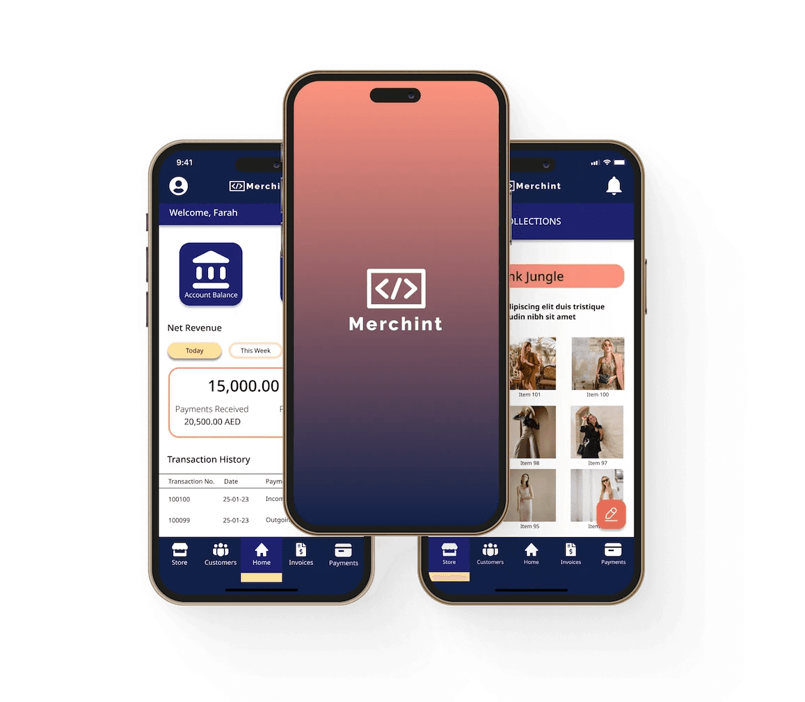
Merchint App
Merchint App
Merchint App
As part of my course at CareerFoundry, I was required to design a responsive web app that allows freelancers and SMEs to display their products and services to customers while keeping track of their account statement and transaction history.
As part of my course at CareerFoundry, I was required to design a responsive web app that allows freelancers and SMEs to display their products and services to customers while keeping track of their account statement and transaction history.
As part of my course at CareerFoundry, I was required to design a responsive web app that allows freelancers and SMEs to display their products and services to customers while keeping track of their account statement and transaction history.
UX Case Study
UX Case Study
UX Case Study
Paymennt is a hybrid app that claims a faster, simpler and friendlier payments experience. They emphasize on SME’s being able to create a complete online store for free where they can sell their products/services and offer cost-effective transaction fees.
SME users would be able to customize their online store with options provided and would have the ability to keep track of their online transactions and send payment links to individual products.
Being a hybrid app is an advantage and can provide flexibility to the user on where they would like to access their account. User can scan a QR code on their webpage to view their account on a desktop.
Variation and customization options provided for user when listing their products/services. However, this could be improved more.
Provides easy integration with user’s existing website.
Recurring subscription payment option is excellent for users who use subscription-based business models.
They provide many channels to contact support ie. Email, phone and chat.
They claim a quick 5 minute sign up process but it took almost 10 minutes (excluding time for user documents approval).
App management manually sends very short videos on how to use certain aspects of the app (onboarding) via Whatsapp. This could be overwhelming and tedious.
Overall UI could be improved to be more attractive. The excessively white background can be off-putting and may need the user to put in more effort to read the text.
Zbooni is a connected-commerce native app that emphasizes on personalizing business. It offers SME’s a platform for the business owners (primary users) to interact and have transactions with their customers, and to enable payments.
It also offers a Marketplace that allows users to display their products and services with personalized re-marketing tools and the ability to track everything.
They’ve adopted the c-Commerce model to address changes in purchasing behaviors and expectations.
Smooth sales process from anywhere at anytime.
Capture sales on same channels users interact with their customers ie. Social media
Requires user to sign up by submitting legal documents first without clear onboarding process.
No option to contact customer service through the app. Instead, user has to go to WhatsApp to find the contact.
No product/services review by customers.
Limited variation and customization options that could be problematic for user when listing products/services.
UI could be improved.
Competitive Analysis
By completing a SWOT Analysis of my competitors, I was able to incorporate their strengths into my design, and turn their weaknesses into opportunities.
Below is a summary of the most prominent points:
User Stories
For this project there are two different types of roles:
User/Merchant - the freelancer or SME that is using the app to sell their products/services and manage financial transactions and inventory.
Customer - who purchases products/services from the User/Merchant on the app.
Users will make up the bulk of user stories, however it is important to consider the Customer’s point of view as well to validate the User’s needs and requirements and address their pain/friction points.
1
Sign up / Open account flow, verification process of user
As a User, it’s important for me to know that the app is secure, so that I do not have to worry when I submit all my personal documents to open an account.
2
Online store/Inventory for users to list their products/services, that include invoicing options
As a User, it’s important for me to know that the app is secure, so that I do not have to worry when I submit all my personal documents to open an account.
3
Payment gateway connection
As a User, I need to ensure that the payment gateway I am using is secure, so that mine and my customers’ financial details are not compromised.
4
Account, admin and financial management
As a User, it is important for me to be able to give my team access to the dashboard, so that we can all be aware of the what is happening with the business and stay up-to-date on orders.
As a User, I need access to my accounts summary, so that I can keep track of the financials of the business.
5
Payment modifications including discounts, subscriptions and refunds.
As a Customer, I would like to get discounts, be refunded if necessary and/or be able to subscribe to a product/service to enjoy the shopping process and avoid inconveniences.
Identify the background of potential users.
Understand what users use to carry out financial transactions, to stay connected to their customers and how they sell their products/services.
What features/functions the users enjoy, in addition to their pain points while using existing platforms in the market.
Research Goals :
SURVEYS
20 Questions
8 Participants
Identify the background of potential users.
Understand what users use to carry out financial transactions, to stay connected to their customers and how they sell their products/services.
What features/functions the users enjoy, in addition to their pain points while using existing platforms in the market.
Research Goals :
Key Findings:
Most users mentioned that what they liked most about the payment app they are currently using is that it was easy to create payment links that could be sent to their customers, in addition to inventory and finances that are automatically updated in their accounts.
Features/functions that the users felt need improvement were in: providing payment reminders to customers, allowing discounts on selected invoices, adding delivery charges to invoice, 24/7 customer support, and having more comprehensive sales reports.
Users mentioned that to increase the sales of their products/services, they would need marketing and promotion, in addition to more variation when listing the products/services.
SURVEYS
20 Questions
8 Participants
Understand what features users need and want on an e-commerce/payment app.
Define the flow and IA of the user’s journey through the app.
Identify positive points and pain points about the existing app(s) that they are using.
Research Goals :
Key Findings:
All users use the e-commerce/payment app through their mobile phones.
All users must be licensed, or have a licensed business.
2 out of 3 users said that they only use the app as a payment platform, and not as an online store because they were not sure how to list their products appropriately.
With regards to listing their products, some users did not find the flexibility or enough features/variations to support displaying their product on the online store (ie. Product variation, type of service, length or time of service).
All users receive payments from their customers through various methods ie. Cash, bank transfers, payment links.
All users are satisfied with the way their account summaries are displayed on the e-commerce/payment app that they are using.
INTERVIEWS
13 Questions
3 Participants
User Research
I was able to determine the users’ needs and pain points by conducting a survey and user interviews.
Affinity Mapping
Affinity Map Insights
By combining the information from the above, I set out to create personas that represent my target audience through their behavioral patterns, goals, challenges and other factors.
Below is an example of one out of three personas that I created.
User Persona
A user journey map was created for all three personas. Here, Khadijah's journey to complete a process is shown.
User Journey Maps
Mapping was created for three flows that our user personas would go through to show their progress in the action they take, while keeping my business objectives in mind. Here, Khadijah's user flow is shown.
User Flows
I used the Card Sorting method via Optimal Workshop. It is an interesting way that shows how users think and feel. Often as designers, we assume that users would want the flow to be in certain way, but testing it could prove otherwise. Our findings are as follows:
IA & Sorting
Users wanted My Profile and Help as main categories under Home, instead of under Settings.
Most categories/sub-categories were aligned as I had initially placed them on the sitemap, as was reflected in the Standardization grid and similarity matrix.
Category names should be precise and deciding what cards to present to participants should be very well thought of to avoid confusion on their behalf.
Would be interesting to re-visit the individual categories with their respective sub-categories in more card sorting exercises.
The Sitemap was revisited after carrying out the card sorting exercise with the participants and changes were applied.
Sitemap
Hand-sketches were made on Procreate to highlight the high-level functionality of the design and show navigation for the three user flows.
Low-Fidelity Wireframes

Make a Payment
Create New Invoice
Create New Collection in Online Store
Here, basic functionality is shown to convey form, function and specifics of the UI.
Mid-Fidelity Wireframes
Test participants were recruited, test objectives and methods were determined, a test plan was developed and a test script was written.
Usability Testing
The following was the outcome:
30 mins
6 Participants
Affinity Mapping
Updated Wireframes
The design was refined, menu features were moved to the top bar with a grid system that was used for reference.
UI was also added with similar visual references as the mobile app.
To ensure that the web app can adapt to different screen sizes and to create fluidity when users browse through it, the designs were applied to a MacBook Pro 14” screen size.
Responsive Framework
Desktop High-Fidelity Wireframe:
High-Fidelity Prototype